01
Essential
- Logo
- Color palette
- Typography
- Mini brand guide
Before designing anything, we understand what your brand represents and what genuinely sets it apart from its direct competitors.
A logo that works as well on a storefront as on an app icon, built to last, not to follow a passing trend.
Choices that have a reason behind them, not a random pick from a free font library.
A reference document that keeps your brand consistent, whether it's applied by you, your team, or an outside vendor.
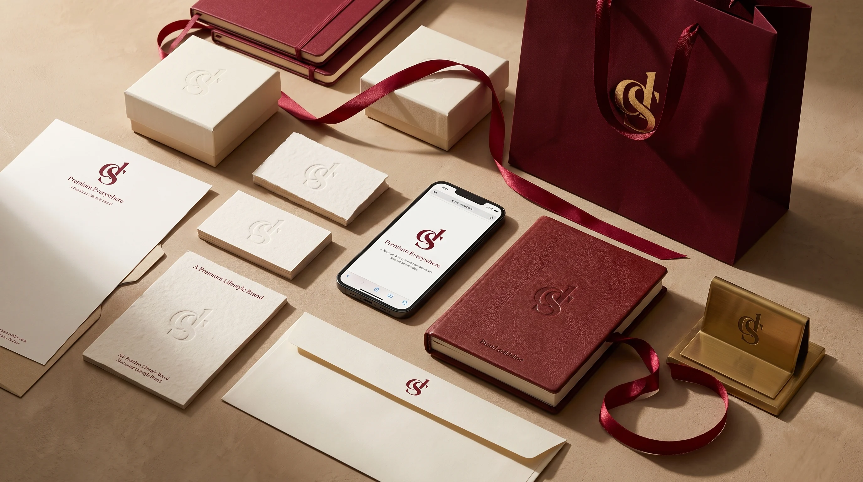
Your identity applied everywhere your brand shows up, with no improvisation for each new format.
A visual system people recognize, remember, and respect.
Analysis of your market, your competitors, and what your brand needs to embody to stand out long-term.
Several visual directions presented and discussed before settling on a final one.
Building the complete system: logo, colors, typography, adaptations.
Handover of all source files and a clear brand guide for consistent application over time.
The packs
Everything included in Essential, plus:
Everything included in Growth, plus:
Not necessarily. We can assess what's working in your current identity and build a coherent system around it, rather than discarding it on principle.
The exact number depends on the package chosen, but the approach stays the same: thoughtful directions built from real research, not ten shallow variations of the same concept.
Yes, all source files are delivered at the end of the project. Your identity belongs entirely to you.
It's precisely for smaller businesses that the difference shows the most. Against competitors with bigger marketing budgets, a strong identity is what lets you compete on perception instead of price.
Between 2 and 5 weeks depending on the package, enough time to properly explore directions before locking in a final one.
What the client says
"We were competing purely on price because our old visual identity looked exactly like everyone else's. DESORA built a bespoke, premium visual system from scratch. We finally have a brand that commands respect and justifies our premium pricing."
Case study
High-end organic cosmetics
A premium French skincare brand launching its flagship offering in Morocco. Their legacy visual identity looked too corporate, clinical, and detached, failing to capture the rich, organic luxury feeling needed to justify a high-end price point on social media and retail shelves.
We threw out the stock templates and clinical colors. DESORA built a warm, minimalist identity using custom, high-end typography, an earthy mineral color palette, and bespoke packaging patterns inspired by North African and French heritage. A unified visual system was created specifically to look premium on both Instagram feeds and luxury boutique shelves.
+260%
increase in organic social media engagement within 60 days of the launch
0%
reliance on discounting, the premium branding anchored a luxury price point on its own
18
distinct retail partners secured across Morocco and France using the new brand guide
"Before DESORA, our brand identity lacked soul. It looked like a generic pharmacy product. DESORA gave us a visual system that feels rare, premium, and instantly recognizable. We didn't just change our logo, we elevated our entire market value."
A visual system people recognize, remember, and respect.